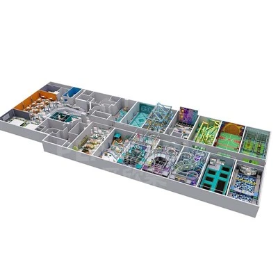
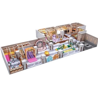
When children enter an indoor playground, what first captures their attention is often not the indoor play equipment, but the burst of color that greets them. Color is not merely a means of decorating a space; it is also a key factor influencing children's emotions, behavior, and even sensory development. Scientific color planning is an essential element that cannot be overlooked when creating a high-quality play space.

Color Influences Children's Emotions and Shapes Their Play Experience
Children's visual senses are more acute than those of adults, and color directly affects their psychological state. Warm tones like orange, yellow, and red naturally exude vitality and are well-suited for active play areas such as trampolines, slides, and climbing structures. They can stimulate children's enthusiasm for play and spark their curiosity; however, highly saturated warm colors should not be used excessively over large areas, as overuse can easily lead to overstimulation, restlessness, and irritability in children. Cool tones, such as blue and green, have a naturally calming effect and are often used in soft play areas and rest zones for young children. They help children settle down and feel secure, and are also suitable for activities requiring concentration, such as building blocks and arts and crafts.
Cleverly Using Color to Define Functions and Guide Play Pathways
Color can also be used to manage spatial zoning. Without the need for excessive hard partitions, color variations can naturally distinguish between active play areas, areas for younger children, and rest areas, thereby guiding children's play pathways. Color schemes should also be tailored to different age groups: Children aged 1–3 are better suited to soft macaron-style colors to reduce visual stimulation; children aged 4-8-year-olds can benefit from the moderate use of bright primary colors, which align with their lively and active nature. At the same time, using color contrasts to mark steps and the corners of equipment can also serve as safety cues.
Avoiding Color Scheme Pitfalls: Rejecting the Blind Pursuit of Visual Clutter
Many indoor play centers fall into the trap of blindly pursuing a kaleidoscope of colors, haphazardly piling together multiple high-saturation hues. An overly flashy environment not only causes visual fatigue but also distracts children, contradicting the original intent of the play space's design. Effective color coordination emphasizes a clear distinction between primary and secondary colors, establishing a dominant color palette complemented by accent colors, while balancing the thematic atmosphere, children's psychology, and parents' aesthetic experience.

When designing children's play spaces, one must not focus solely on the functionality of the equipment but also consider the environmental experience from a child's perspective. A well-thought-out color scheme can enhance the indoor playground's atmosphere, safeguard children's emotional well-being while they play, and ensure the space truly meets their developmental needs.
Playpedia Amusement specializes in comprehensive indoor children's play solutions.
By integrating color psychology and an understanding of children's behavioral characteristics, we provide clients with free design proposals-offering one-stop implementation from color planning and spatial zoning to equipment selection-to help create high-quality indoor children's play projects that balance aesthetics, safety, and the overall experience.