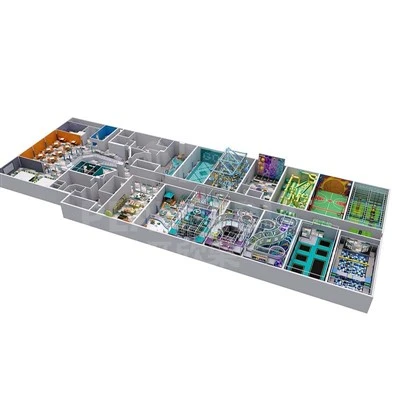
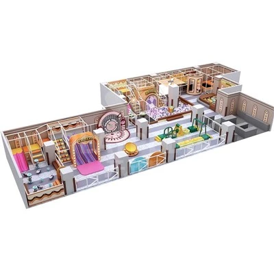
Many indoor playground operators rely solely on personal preferences when finalizing color schemes for custom equipment, only to face issues such as low visitor traffic, unflattering photos, and a gloomy atmosphere that discourages parents after the project is completed. As a manufacturer specializing in end-to-end customization, we've learned from hundreds of amusement park projects both domestically and internationally that color schemes are far more than mere aesthetic choices-they are at the core of commercial design, tailored to local consumer habits, cultural preferences, and site conditions. A color scheme tailored to the local market can directly boost repeat business and online visibility.
To finalize a color scheme for implementation, the first step is to analyze the characteristics of the local market's core customer base. Domestic retail stores in commercial districts primarily target young mothers and young children; the mainstream choice is a low-saturation "macaron" color palette. Soft, non-glaring shades like pale milk blue, peach pink, and off-white complement the soft lighting of shopping malls, naturally invite photo-sharing, and are well-suited for short-video sharing; Community-based parent-child stores cater to a broader demographic, spanning all ages from 0 to 12. A tiered color scheme can be adopted: for the 0–3-year-old soft play area, use pale green and light yellow to soothe young children, while for active zones like climbing walls and trampolines, pair light orange and sky blue to enhance a sense of dynamism; Customers at county and township locations prefer lively visuals, so color saturation can be moderately increased. A base palette of red, yellow, and light blue paired with a natural wood background creates a down-to-earth look and offers better value for money.

For cross-border indoor playground projects, it is essential to prioritize avoiding color-related cultural misunderstandings and to align with local aesthetic preferences. The Southeast Asian market favors high-contrast, high-brightness colors; combinations of yellow, red, and turquoise blue create a strong visual impact; In contrast, upscale venues in Europe and the United States favor the soft tones of the Morandi palette and cream hues; this minimalist yet refined style is particularly well-suited for family-friendly cafes; the Middle Eastern market, meanwhile, favors gold, purple, and teal, while pure white and other shades with negative connotations in the local culture should be avoided to minimize the costs of rework and color changes from the outset.

Step 2: Adjust the color palette based on the venue's physical features and size. For small stores, avoid cluttering the space with too many colors; instead, use a unified light color scheme to create a sense of spaciousness, accenting with just 1–2 bright colors. For play areas in underground malls with low ceilings and insufficient natural light, avoid dark tones like deep gray or dark green; instead, choose milky white or light blue to brighten the overall space and prevent it from feeling gloomy. For street-facing stores with ample natural light, incorporate low-saturation dark colors to add depth, prevent colors from appearing glaring under strong light, and reduce visual fatigue for children. At the same time, follow the logic of zone-specific color schemes: use cool tones like blue and green in sandpits and educational construction areas to create a calm atmosphere, and use warm tones like orange and yellow on slides and obstacle courses to stimulate energy. Use color to naturally delineate traffic flow without the need for additional partitions.
Step 3: Align the store's positioning and long-term operational needs to determine the primary and secondary colors. High-end mall indoor play centers should emphasize a "light luxury" aesthetic, primarily using the Morandi color palette with metallic silver and pale gold accents to meet parents' demand for refined experiences; affordable community play centers should prioritize stain-resistant light gray and light khaki base colors to minimize cleaning issues and the appearance of wear over time; chain brands must incorporate their standard brand colors to ensure visual consistency across multiple locations. Here's a tip for operators to avoid pitfalls: Do not use more than five highly saturated colors. While this may attract attention in the short term, it causes visual fatigue very easily, leading parents to be unwilling to stay for long periods and directly shortening the average visit duration.
Finally, the source factory implements a supporting process to ensure zero deviation in color matching. After confirming a market-appropriate solution, we provide physical color swatches and soft-padded PVC samples for on-site comparison by the client, combined with lighting renderings of the venue to simulate real-world colors; Soft play equipment is produced using uniform color codes throughout the entire process, ensuring consistent tones across ball pits, floor mats, soft-padded panels, and slide components, thereby eliminating color discrepancies and the need for rework. At the same time, we allow for minor color adjustments to accommodate local cultural traditions or popular themes, creating distinctive visual elements that help stores stand out.

A well-chosen color scheme is a low-cost tool for attracting customers to a play center; "viral" color schemes that are disconnected from the local market will only be a fleeting trend. During the customization phase, we screen color tones based on three dimensions-the local demographic, the venue, and the brand positioning-and then implement them through standardized production at the source factory. Only then can we create a long-lasting color scheme that is visually appealing, attracts customers, and aligns with local consumer commercial indoor playground preferences.